Monday, January 14, 2013

Color Pop Art Paintings


My Paintings


In this unit, we spent the time drawing and painting four pictures of a single object.  We went in a route with four different sets of colors: monochromatic, triad, analogous and complimentary. Then, after desidnig which colors, we decided what textures we wanted the observers to feel.  In my four paintings I chose to paint my monochromatic painting first.  I decided on purple.  For my first painting, I made the texture, clean, but loose.  Everything was supposed to look defined and outlined, yet straight brush strokes, and in the background it almost looks "whispy" like all these different colors coming togehter.  For my second painting, I decided to make it a black and white complimentary.  This painting was meant to look "blotchy" and "fuzzy."  The third took the longest.  I gave the job to my creative side and used the back of the brush to make a "dotted" painting.  It is my pink, orange and red analogous.  It took 5 classes to finish it off, but I am proud.  My last, and final, painting was my triad.  I chose to use the primary colors: red, yellow and blue, and wanted to make it clean and neat.  After making the top red, the ground yellow and the object different shades of blue, I added a touch of the other two colors onto the blue object to finish off the accents.  I ended up making it look a little "fuzzy near where the border of the yellow and red meet.  It adds to the painting a lot and I think that it makes it look neater in the end.  

In my group feedback, most of the group agreed that my "dotted" analogous was indeed their favorite.  They said that it was 'feely' and that it 'made them want to touch it.'  This was my hope that people would look at the texture and just make them want to 'feel' it. They also said that in my purple, monochromatic that it was more loose and straight than defined.  This comment made me go back and realize that it wasn't as I had hoped to look as defined and neat as I wanted, but the end result was alright as well.  

Out of all the different types of art we have learned over the year, my favorite has probably been photography.  I have learned to express myself through a different lens, taking in all colors and shapes.  It has been fun to edit them too make them even a little more personal.  

Tuesday, November 13, 2012

My Final Photogram Project

Degree of Exploration (stretch and explore)

Did you come up with your shapes for this project?
Not all, but most of the shapes i came up with on my own.  I created all of the shapes on the right,             (wave looking thing and the m). but on the right i looked up an image and drew the symbol (the buddah symbol).  But, everything else I came up with on my own.

What types of shapes did you explore?
At first, I started to cut out random shapes, but i went with a beach theme.  There is a sun looking thing, a wave and something that could be represented as a surfboard.

What methods helped you explore your shapes?
I had the influence of another students work.  It was way more flowy than mine, but it only influenced it, they look absolutely nothing alike.

Degree of Craftsmanship and Attention for Detail (engage and persist)

How does your process-folio exemplify your exploration of "shape"
In the beginning of this unit, our class learned about different types of composition.  This project showed our exploration of "shape" because we could choose if we wanted to do contrasting shapes or flowing shapes or pointing shapes.  We had to piece it together to make a good composition.

To what degree did you push yourself to rework and refine your work?
I have only completed 1 final work piece, but it took many attempts.  At first i wanted to go for the idea of size, and so i cut out a bunch of different numbers and letters of a variation of shapes.  That didn't look how i thought it would, so i went for a flowing, connecting look, I didn't like that either.  So my final project consisted of just imagination.  I am now working on a 4th, even though it will not be on my final, I like it the best because it took me so many tries to complete it.

How well unified are the compositions of your final collage and photogram diptych.
The diptych of my final collage and photogram are contrasting.  They are upside-down from each other and one is black on white and the other is white on black.  They look almost identical, but they are very different.

Level of Technical understanding and Growth
In what ways have you developed technically in the areas of drawing, collage, and developing witht the enlargers.
I did not use the enlarger.
Are your final works free of glaring technical flaws or difficulties?
I will say that when I was in the dark room, I ended up running out of time.  This effected me because I couldn't put my photogram in the processors as long as i was supposed to.  This effected it because i couldn't put it in the 2nd water wash to put a shine and even out the color.
How might your works have beneffitted from technical understanding or control?
My works could have benefitted by looking more polished and clean.  There are some liquid looking lines all over my photogram, so that could be gone.

Degree of insight in "aesthetic valuing" and self-reaction

How thorougly were you involved during reflective or evaluative discussions, peer pairings and blog writups.
During my last blog I could not finish because I didn't have my finished photo.  I was pretty focused and involved in the peer pairings and discussion though.

How thoroughly are you able to communicate your aesthetic insights and concepts?
I can communicate my aesthetic insights and concepts pretty well.

Color


My Colors


          My intention with this image was to capture an color pattern of analagous of red, yellow and orange.  I did this by taking a picture of these trees in the fall, while their leaves were dying and about to fall off.  On the other side I was thinking of making leaves, but I felt like it would be too complicated and look messy, so I stuck with simple shapes.


      My intention with this image was to capture the sunlight hitting the purple flower, and contrasting with the green, and a little bit of yellow, to get a triadic color wheel.  I felt like the square color shapes would contrast with the round leaves.


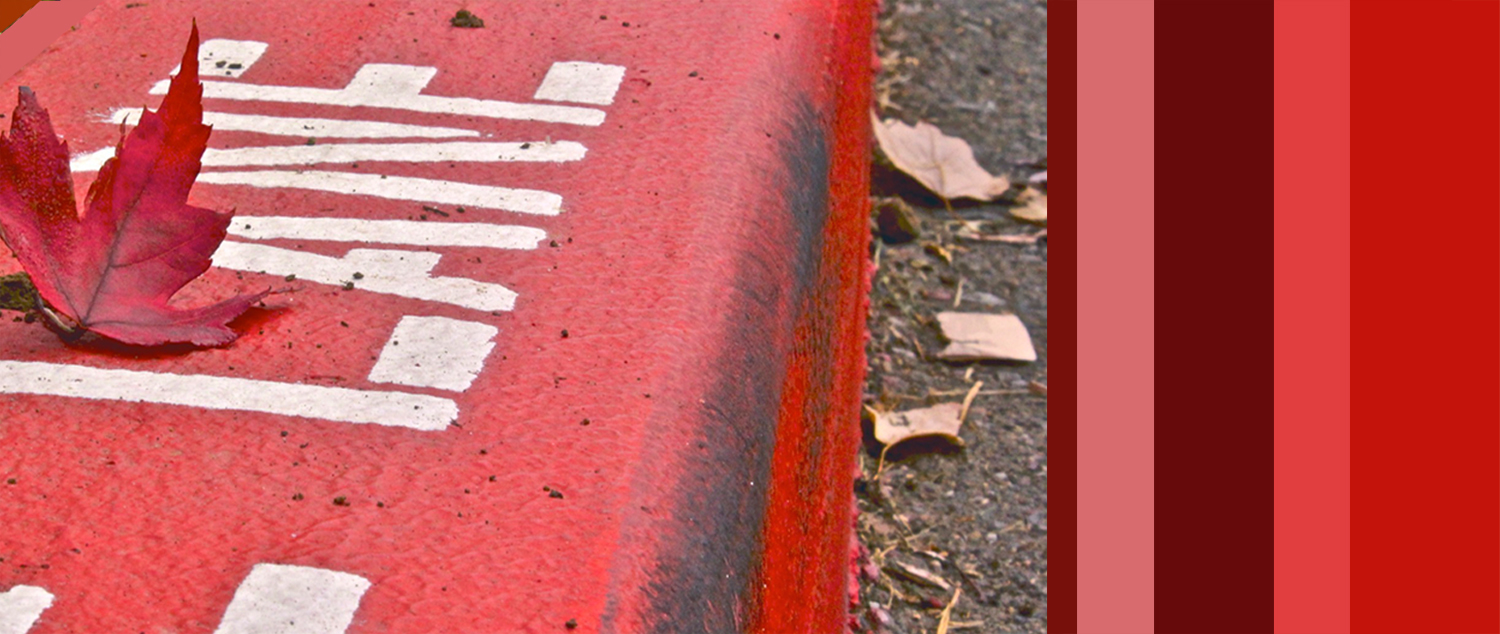
           My intention with this image was to capture a monochromatic image.  I did this by finding a red leaf on the red fire-lane, with a little bit of black.  The black is not a color so it does not contrast with the red image.  I added stripes on the right to make it consistent, like the red fire-lane.


               My intention was to capture the contrasts of the red flag and the green field.  In the image to the right, I created a color pattern for the colors on the left, and added a white stripe in the middle to represent the white flag in the middle of the picture.  

Saturday, October 27, 2012

Shape and composition Photography project


The first image is my composition already.  I have not finished yet, but I am planning on creating more black on the left side too balance out the left side.  Alex and I talked about to add a mirrorating image on the left side that mirrors the right. I ended up doing something else though in the end for my Photogram.  I created an almost exactly mirror of the paper cut out.  I used some pieces from it and added some objects such as a pencil, wood cut outs, nails etc.


-


Thursday, September 20, 2012

Wire Sculpture of Olympic Figure


Wire Sculpture
USA Olympic Gymnast

            My wire sculpture is portraying the Olympic gymnast, Jordyn Weiber.  It uses lines to articulate the motion by smoothly bending the wire into the shape of the picture.  I used one main piece of wire to articulate the body, and then a few other thinner pieces of wire to portray the muscles.  
           The sculpture illustrates my technical development because I spent a lot of time figuring out how to sculpt this project.  I used the techniques I have learned so far this year from contour drawings and how you have to have thicker, darker lines to make certain objects stand out.  The sketches resemble my final piece mostly because it is the same size and the activity that the sculpture is illustrating.  It is different than my sketches mainly because it is 3D, but partly because it does not have as much detail as I planned.  I sketched the design of the leotard, but did not end up articulating that on my sculpture. 

Tuesday, September 11, 2012